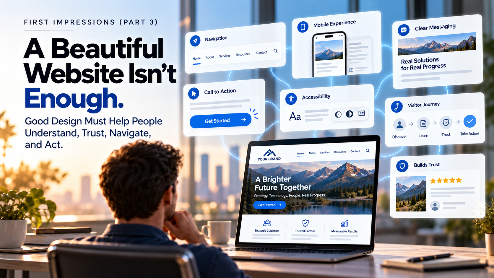
A Beautiful Website Isn’t Enough
Imagine visiting the website of a company you are considering hiring.
The photography is impressive. The colors work beautifully together. There are smooth animations, elegant typography, and a homepage that looks like it belongs in a design portfolio.
At first glance, you are impressed.
Then you try to figure out what the company actually does.
You scroll. You click. You read a few paragraphs filled with broad promises about innovation, quality, and exceptional service.
You still are not entirely sure whether the company can help you.
So you leave.
The website may have looked beautiful. But it did not do its job.
That distinction matters because a website is not simply a place to display your brand. For many prospective customers, it is where they decide whether your business is worth exploring further.
And good design needs to help them make that decision.
Your Website Is an Experience, Not Just a Presentation
In the previous article in our First Impressions series, we explored the difference between operating a business and building a brand. We talked about how a brand creates expectations and gives people reasons to feel confident choosing one organization over another.
Your website is one of the most important places where those expectations become an experience.
It introduces your organization, communicates your capabilities, answers questions, and helps people decide what to do next.
But there is a difference between presenting information and making that information useful.
A beautiful brochure can make a company look impressive. A website has to do more. Visitors arrive with questions, needs, and varying levels of familiarity with your business.
Some want to understand your services. Others are comparing providers. Some need reassurance that you have relevant experience. A few are ready to contact you right now.
An effective website makes room for all of them.
It is not designed only to be admired. It is designed to be used.
The Visitor Is Not Looking at Your Website the Way You Are
Business owners know their organizations from the inside.
They understand the services, the terminology, the team, and the reasons customers choose them. They know which projects are most impressive and which capabilities make them different.
A first-time visitor knows almost none of that.
Consider a manufacturing company that describes itself as “delivering integrated, next-generation solutions through a commitment to operational excellence.”
That language may sound professional. But what does the company manufacture? Who does it serve? What problems does it solve?
Now imagine the company instead explains that it designs and manufactures custom components for medical equipment makers, with experience handling complex production requirements.
The second description may be less dramatic. But it gives the right visitor something useful.
People should not have to translate your marketing language to understand whether you can help them.
The goal is not to explain everything immediately. It is to make the most important things clear enough that visitors want to keep going.
A Strong First Impression Should Lead Somewhere
Visual design absolutely matters.
An outdated or poorly assembled website can create doubt before someone reads a single sentence. Professional photography, thoughtful typography, appropriate color, and consistent branding can help an organization feel credible.
But appearance is only the beginning.
Research from Stanford University’s Web Credibility Project has long identified both professional appearance and ease of use as important elements of website credibility.
Those are not competing priorities. They support each other.
A polished homepage may encourage someone to stay. Clear information and an intuitive experience give them a reason to continue.
If the visitor is impressed by the design but cannot find a service, understand a process, or locate contact information, the initial positive impression starts to weaken.
The strongest websites make the next step feel natural.
Navigation Should Help People, Not Make Them Think
Imagine walking into a well-designed office building with no signs.
The lobby is beautiful. The finishes are expensive. Everything feels carefully considered.
But you cannot find the department you came to visit.
Eventually, the impressive surroundings become less important than the frustration of not knowing where to go.
Website navigation works the same way.
Visitors should not have to guess whether information is under “Solutions,” “Capabilities,” “What We Do,” or a clever phrase that only makes sense to the people who created it.
Creative language has its place. Navigation usually benefits from clarity.
Organizing pages around the way customers look for information can be more helpful than organizing them around internal departments or company terminology.
And not every visitor enters through the homepage. Someone may arrive directly on a service page from a search result or a link shared by a colleague.
Wherever they arrive, they should understand where they are, find related information, and move forward without unnecessary effort.
The Mobile Experience Is the Website Experience
It is easy to approve a website design on a large desktop monitor.
The images have room to breathe. The navigation is fully visible. Every section seems balanced.
Then someone opens the same website on a phone.
The text becomes difficult to read. Buttons sit too close together. A large image pushes the useful information far down the page. A form that seemed simple on a computer suddenly feels tedious.
The website has not changed its message. But it has changed the experience.
For many visitors, a phone is not a secondary way of browsing. It is how they encounter your business.
That means mobile design should not be treated as a smaller version of the desktop layout.
It should account for the way people actually use their devices: shorter moments of attention, touch navigation, smaller screens, and the need to find information quickly.
A website that works beautifully only on a designer’s monitor is not finished.
Clarity Is Often More Valuable Than Cleverness
Businesses understandably want their websites to sound distinctive.
They want language that reflects their personality and avoids sounding like every competitor.
That is a good goal. But sometimes the effort to sound different makes the message harder to understand.
Consider a professional services firm whose homepage leads with “Transforming possibilities into tomorrow.”
The phrase might sound inspiring. But a prospective client still needs to know what kind of firm it is and what it can help accomplish.
Clear messaging does not have to be boring. It can be confident, engaging, and memorable.
It simply needs to answer the questions visitors bring with them.
Who are you? What do you do? Who do you help? Why should someone believe you can deliver? What should they do next?
If those answers are buried beneath vague claims, impressive design cannot make up the difference.
Good website design gives clear messaging the space and structure it needs to work.
Make It Easy to See Why Someone Should Trust You
Visitors are often evaluating a business they have never worked with before.
They may be comparing several organizations that appear to offer similar services. They are looking for reasons to believe your company understands their needs and can deliver what it promises.
A website can help provide those reasons.
Relevant project examples show the kinds of work you do. Team biographies put real people behind the business. Clear explanations of your process help visitors understand what working with you might look like.
Testimonials, case studies, certifications, and other evidence can reinforce credibility when they are relevant and presented accurately.
But trust is not built by filling a page with badges and superlatives.
It grows when the information feels specific, useful, and believable.
A company that says it is experienced is making a claim. A company that clearly explains its experience and shows how it benefits customers gives visitors something they can evaluate.
That is a meaningful difference.
Accessibility Is Part of Good Design
Not everyone experiences a website in the same way.
Some visitors use keyboards rather than a mouse. Some rely on screen readers. Others need readable text, clear contrast, captions, or forms that are easy to understand and complete.
Accessibility is not simply a technical box to check at the end of a project.
It is part of designing an experience that works for the people you want to reach.
For example, clear headings make a page easier to scan. Descriptive links help people know where they are going. Properly labeled forms reduce confusion. Readable typography benefits far more than one group of users.
These decisions can improve usability for everyone.
And a website that creates unnecessary barriers may prevent a prospective customer from learning about a business that could otherwise serve them well.
Good design considers not only how a page looks, but whether people can actually use it.
Every Page Should Have a Purpose
One of the most common website problems is not a lack of information. It is a lack of direction.
A homepage introduces the company, but never tells visitors where to go. A service page describes capabilities, but offers no logical next step. An article provides helpful information, then ends.
The visitor has to decide what to do without much guidance.
Not every page needs to push someone toward an immediate sales conversation.
A visitor who is still researching may benefit from a case study, an explanation of your process, or a related article. Someone ready to act may need an obvious way to request a consultation or ask a question.
The right call to action depends on the purpose of the page and the needs of the visitor.
What matters is that the next step is understandable and easy to find.
If your website creates interest but offers no clear path forward, some of that interest will disappear.
A Website Should Support the Business Behind It
A company website can serve many purposes.
It can introduce your business to new customers, help existing customers find information, support sales conversations, demonstrate expertise, attract employees, or make it easier for people to request service.
Those goals should shape how you plan the website.
Consider two architecture firms.
One builds a dramatic portfolio site that showcases beautiful project photography. The work looks exceptional, but visitors struggle to learn what types of projects the firm accepts, which markets it serves, or how to begin a conversation.
The other also presents compelling work, but pairs that work with clear service descriptions, relevant project context, an approachable explanation of its process, and an easy way to inquire.
Both websites may be visually impressive.
But the second does more to connect the firm’s capabilities with the questions a prospective client is likely to have.
The difference is not that one firm cares about design and the other cares about business.
It is that one has made design work harder for the business.
The Best Website Improvements Are Not Always the Most Visible
When a business considers redesigning its website, the conversation often begins with appearance.
The homepage feels dated. The imagery needs updating. The layout no longer reflects the company.
Those may be valid reasons to make changes.
But sometimes the most valuable improvements are less dramatic.
Rewriting a confusing headline. Simplifying the navigation. Making service information easier to find. Improving a contact form. Removing an unnecessary step between interest and inquiry.
None of those changes necessarily creates a dramatic before-and-after image.
But each can make the website more useful.
This is why the best starting point is not always “What should the new website look like?”
It may be “What do our visitors need to accomplish, and what is getting in their way?”
Once you understand that, the design decisions become much more meaningful.
Look at Your Website Through a Customer’s Eyes
It can be difficult to evaluate a website you have seen hundreds of times.
You know where everything is. You know what the terminology means. You know which pages contain the important details.
A new visitor does not have that advantage.
Try approaching your website as though you know nothing about the company.
Can you understand the business without reading every paragraph? Can you find a particular service without guessing? Do the pages give you reasons to trust the organization? Does the experience still work when you use your phone?
And if you decide you want to speak with someone, is the next step obvious?
It can also be useful to ask someone unfamiliar with your company to complete a few simple tasks on the site and explain what they find confusing.
You may discover that the most important opportunities have little to do with making the website more attractive.
They have to do with making it easier to understand and use.
The Website Check
As you think about the experience your website creates, consider these five questions:
- Can a first-time visitor understand what your company does and who it helps without searching for an explanation?
- Can visitors easily find the services, examples, and information they are most likely to need?
- Does the website work as well on a phone as it does on a desktop computer?
- Does your content give people specific reasons to feel confident in your organization?
- Is the next step clear, whether someone is ready to contact you or wants to learn more?
If you hesitate on one or more of these questions, that does not automatically mean your website needs to be replaced.
It may mean there is an opportunity to improve the experience you are already providing.
Sometimes a thoughtful change in messaging, structure, or navigation can do more for a business than an entirely new visual treatment.
The goal is not simply to create a website people admire. It is to create one they can use with confidence.
What Comes Next
This is the third article in the TrueBridge Creative First Impressions Series.
In our first article, we looked at the impressions businesses create before customers ever make contact. In the second, we explored how those impressions develop into a brand people recognize, trust, and choose.
Here, we have focused on one of the most important places that brand comes to life: the company website.
But even a well-organized website can struggle if the words do not explain the business clearly.
In our next article, Bridging the Gap: From What You Do to What Customers Understand, we will explore why organizations often struggle to communicate their value in language customers immediately recognize.
Because the challenge is not always what your business can do.
Sometimes it is how clearly you help other people understand why that matters.
A beautiful website may get someone’s attention.
A useful website gives them a reason to stay.
Is Your Website Helping Customers Take the Next Step?
Your website should do more than make your company look professional. It should help visitors understand your services, recognize your value, and feel confident taking the next step.
If you are not sure your website is creating that experience, we can help you find out.